You would think that disabling auto updates would disable the fucking auto updater? No it…
The Yoast SEO Plugin is the most annoying Plugin EVER
Yes it’s simple as that and here is why. The Yoast SEO Plugin has it’s functionality, yes – it works as expected and is based on thorough SEO knowledge. But basically it does not do too much. It does not do any magic or something you could not accomplish without it. Being bad you might call it a better sitemap- and tag-manager, because the rest is just some quick content checks and links for keyword research and some guidance on how to write a good post. That’s it? No there is a ton more – but these are mostly just annoyances and ads.
Yoast SEOs main purpose is to advertise itself
What Yoast SEO does best is to create awareness for itself. It does this on many levels in almost any area of your website. Visible and invisible. For instance: It „infiltrates“ your sourcecode with unnecessary hints on the plugins existence. This is very bad practice and has been the topic of many discussions in the wordpress forums. Just for security reasons plugins should never identify themselves within the sourcecode. It’s an unwritten law – but not for Yoast SEO.
You might guess, that mentioning the Yoast brand and plugin also has a purpose, of course this works as a SEO measure for that doubtful Yoast Company and it’s overpriced services. Just look at the sourcecode of a clean website that uses the Yoast SEO plugin. There are at least 6 occurences that mention the Yoast plugin and it’s version (which makes it even worse, in case a specific version has a bug or a security flaw).
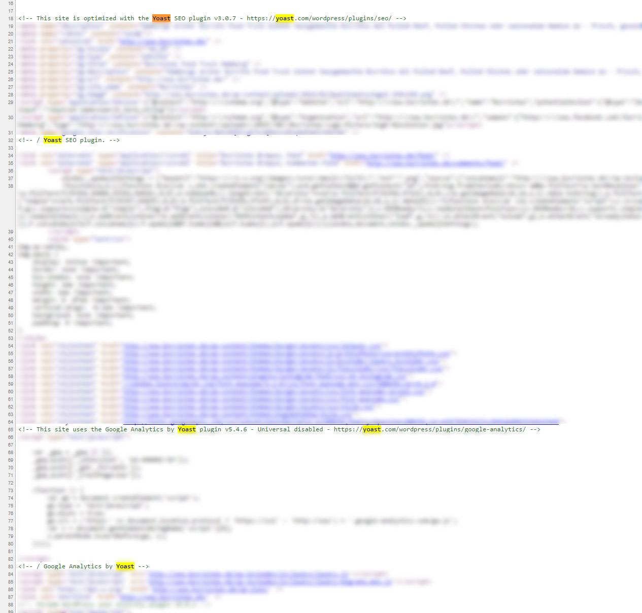
See the discussions about the sourcecode invasion for instance: The author of the plugin at first denies that these mentions are for promotion. Then admits he will never remove those lines and after some guy throws in, that the function that puts these comments into the sourcecode is just named „promo“ he just renames it to „debug“ and asks the mod to close the thread. Sounds like a clearly bad and doubtful practice to me and his reaction is even worse.
Forcing Brand Awareness
Yoast is a brand that wants you to never forget about the fact that you are using one of it’s products. This is why Yoast SEO is one of the plugins that constantly updates without any real new functions. Don’t get me wrong. The plugins does evolve and gains new functionality over time, but most of the time it does not. It simply updates for whatever lame translations or minor bugfix reasons just to annoy you and keep it’s name in your mind. Why do I think that? Because it puts a lot of effort in it’s update procedures. After each update it creates a box telling you to check out the new version. Nice but unnecessary. It just doesn’t silently update. It annoys you the whole process long. Before – as an update request (not sure, guess they deactivated that) and after – as an update information nag. Weird and again bad practice, especially if there is not really much progress going on between the versions.

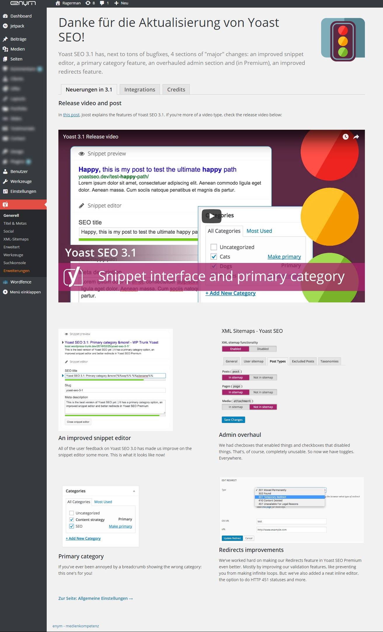
And when there are really new functions it pushes itself on a level just as the wordpress core. Yoast mimics the style of the original wordpress core update info page. When upgrading Yoast SEO sometimes you are automatically redirected to this page. Hmm one might say yah, that’s cool, cause there is lot to learn. I say, no it’s not cool. A plugin that is a helper should just silently stay in the background and help, and not push itself so much to the front that you have to navigate around it to not be distracted. Simply put: Imagine a few more of your plugins behaving just like that. Almost every login into your site would be like running the gauntlet just to get a few things done and to avoid those various unnecessary nags.
Do not follow standards
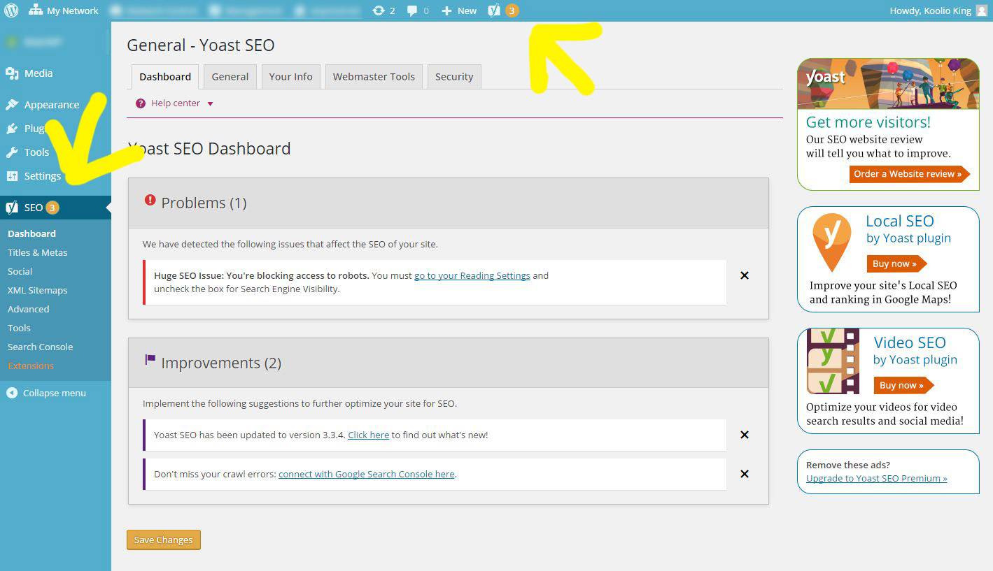
It totally fits into that scheme that Yoast SEO does not to use generic official wordpress dashboard icons. And there are plenty that could be used as a SEO indicator. No – Yoast, of course, uses it’s „Y“ Logo in your WordPress menus. by the way, it attaches to both, to the admin bar and to the sidebar. Just in case you missed it. But hey okay, it is their Logo. Yes that‘ right, okay, but it does not stop there. Yoast puts a lot of effort into constantly letting you know that it is there and that you need to use it. In the admin bar there is a Yoast menu which uses nonconsistent coloring for it’s Number tags. Why is that? There is no sense at all besides alerting „over the top“ (just look at the rather subtle plugin updates indicator for comparison).
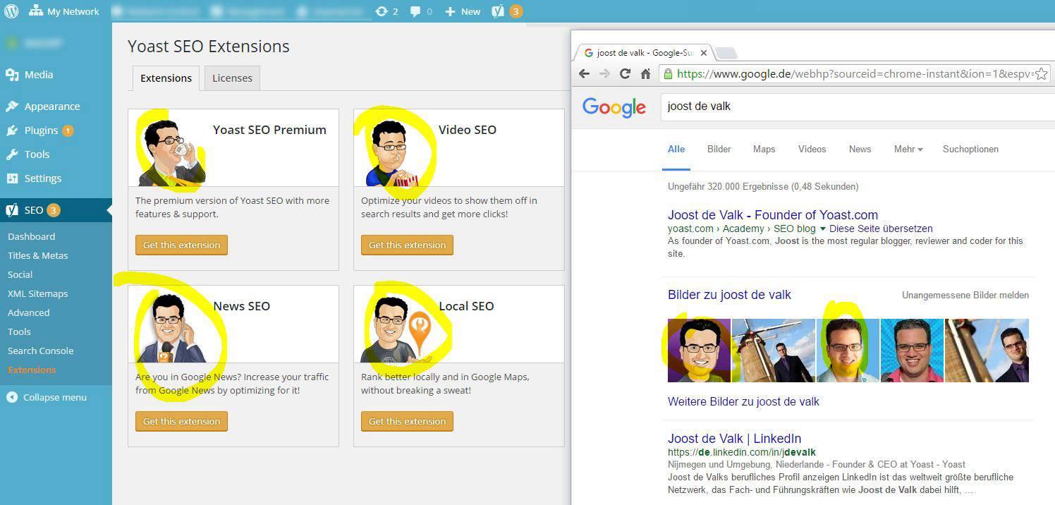
Last but not least. All Yoast Branding is based on a cartoonish guy eating, drinking, doing stuff. That guy is the inventor of Yoast and the company name is based on his real name. Well, this gives me an indication of what type of guy this fellow is. Can’t get enough of himself and his plugin. Okay, this might sound superficial, but my impression is just justified by the type of answers he gives the community in the forums when someone complains.

Bottom line. The plugin is nice and free but very annoying. I will slowly remove it from all of my sites and I hope many others will do so as well. I will consider paying for a plugin instead. If thats the price for quality after all I am totally willing to do so. Lesson learned – Don’t you mess with my websites anymore, Yoast SEO.

Best view i have ever seen !